When it comes to logo design, we believe that they must translate well in black and white. Take away all the colours, tones, fancy visual effects, and what are you left with? The most iconic logo design examples are instantly recognisable because of how well they translate to other backgrounds and surfaces. If the message remains clear in black and white, colour can easily be added to compliment it. Read on to find out why you should consider having a black and white logo first.
What makes a black and white logo design effective?
Clear message
When I design, I generally start the logo in black and white. This is because I want the message to be clear even if there aren’t any colours to help communicate it. When you look at a swoosh you think Nike, and when you see an apple with a bite out of it, you immediately think of Apple computers. When a logo is being designed in black and white it convinces the designer to think outside the box in order to create something that works and doesn’t just look nice. A brand that uses an image of a flame doesn’t have to be red, and a river doesn’t have to be blue to see what it is.
Simple shapes
A logo needs to be quickly recognisable, therefore having a complicated layout doesn’t necessarily help. In fact, when I design a logo I end up stripping back all the shapes around it because they just end up as useless clutter.
Readable text
When it comes to logos, especially for high-end fashion brands, an image isn’t always used. In this case, you often see that the text is what sends the message home. These can be a bit more tricky to pull off because the text also has to be readable in various sizes. In many cases, an entirely new font is created just for the brand.
Balance
Some logos just don’t ‘feel’ right, and this is due to it being off-balance. For example; the text is not being centered. This is why useful techniques such as the Golden Ratio or rule of thirds are so effective. They help us get the right balance on the canvas so that the logo isn’t uncomfortable to look at.
Negative spacing
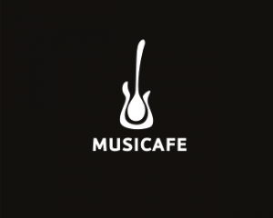
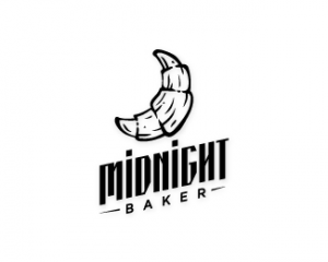
Negative spacing is often found in many black and white logos. It’s when the space around a subject is used to create another image. This is extremely effective when it comes to communicating multiple messages in one place. More examples of this can be found below.
Black and white logo design inspiration